Designing for Inclusion: Web Accessibility for Color Blindness

Color blindness is a condition that affects the ability to perceive colors. There are three types of color blindness: red-green, blue-yellow, and total. People with color blindness see colors differently than most people and may have difficulty distinguishing between certain shades or hues.
Web accessibility is the practice of making websites usable and accessible to people with disabilities, such as color blindness. Web accessibility is important for color-blind individuals because it ensures that they can access the information and services that websites offer without any barriers or difficulties.
In this article, we will explore the impact of color blindness on web accessibility, the principles of designing for color-blind users, and some tools and techniques that can help designers create accessible websites.
Understanding Color Blindness
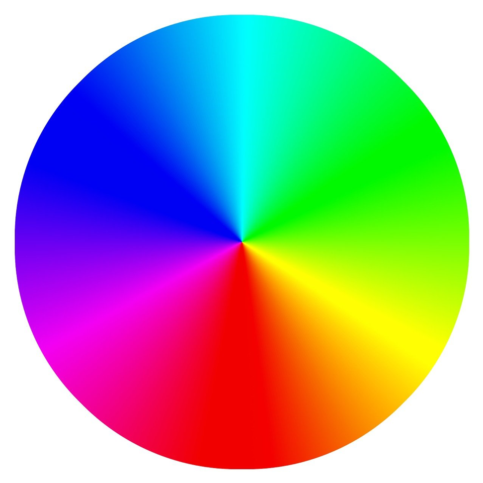
Color blindness affects vision in different ways depending on the type of color blindness. People with red-green color blindness see red and green as shades of gray, while people with blue-yellow color blindness see blue and yellow as shades of gray. People with total color blindness see all colors as shades of gray.
Color blindness can affect how people perceive shapes, sizes, distances, emotions, and other aspects of visual information. For example, people with red-green color blindness may have trouble reading text or icons that are green or black, while people with blue-yellow color blindness may have trouble reading text or blue or white icons.
According to the American Academy of Ophthalmology, about 8% of men and 0.5% of women in the United States have some form of color blindness. The prevalence varies by region and ethnicity. For example, in Europe, about 2% to 4% of men and 0.1% to 0.2% of women have some form of color blindness.
The Impact of Color Blindness on Web Accessibility
Color-blind individuals face many challenges when using the web. Some common web design elements that can be problematic for them are:
- Text: Text can be hard to read for color-blind users if it is not contrasted well with the background or if it uses colors that are not visible to them. For example, black text on a white background may be difficult to read for people with red-green or blue-yellow color blindness.
- Images: Images can be hard to perceive for color-blind users if they rely on colors that are not visible to them or if they do not provide enough context or information. For example, a red rose may look like a purple flower for someone with red-green or blue-yellow color blindness.
- Buttons: Buttons can be hard to click for color-blind users if they use colors that are not visible to them or if they do not provide enough feedback or indication. For example, a green button may look like a gray button for someone with red-green or blue-yellow color blindness.
- Links: Links can be hard to follow for color-blind users if they use colors that are not visible to them or if they do not provide enough contrast or clarity. For example, a blue link may look like a black link for someone with red-green or blue-yellow color blindness.
These challenges can affect the usability and functionality of websites, as well as the satisfaction and experience of users.
Principles of Designing for Color Blindness
To design websites that are accessible and inclusive for color-blind users, designers need to follow some principles:
- Contrast: Contrast is the difference between two elements in brightness, size, shape, position, etc. Contrast helps users distinguish between elements and read text easily. Designers should use contrast tools such as contrast checkers or contrast ratios to ensure that their text has enough contrast with its background.
- Patterns and textures: Patterns and textures are visual elements that create interest and variety in web design. Patterns and textures can help users recognize shapes, sizes, distances, emotions, etc., by providing cues such as directionality, movement, depth, etc. Designers should use patterns and textures sparingly and strategically to avoid confusion or distraction.
- Avoiding color-dependent instructions: Color-dependent instructions rely on colors to convey meaning or information. For example, a green arrow pointing up means “go up”, while a green arrow pointing down means “go down”. Color-dependent instructions can be confusing or misleading for users who have different types of color blindness.
Designers should avoid using colors as instructions unless they are absolutely necessary or unavoidable.
Tools and Techniques for Designing Accessible Websites
There are many tools and techniques that can help designers create accessible websites for color-blind users. Some examples are:
- Color blindness simulators: Color blindness simulators are online tools that allow users to test how different types of color blindness affect their perception of colors. Users can adjust their settings such as type of color blindness, lighting conditions, etc., and see how their vision changes accordingly. Color blindness simulators can help designers understand how their designs look from different perspectives and identify potential problems or solutions.
- Color contrast checkers: These are online tools that allow users to check how well their text and background colors contrast with each other. Users can enter their text and background colors and see if they meet the minimum contrast requirements for readability. Color contrast checkers can help designers ensure their text is legible and accessible for color-blind users.
- Web Content Accessibility Guidelines (WCAG): WCAG is an international standard that provides guidelines and best practices for web accessibility. WCAG covers various aspects of web design, such as perceivable, operable, understandable, and robust. WCAG also provides specific color contrast criteria, such as level 2.0 (40:40) or level 3.0 (70:30). Designers can use WCAG as a reference or a checklist to evaluate and improve their web accessibility.
Case Studies
To illustrate how these tools and techniques can be applied in practice, we will look at some examples of websites that are well-designed or poorly designed for color-blind users.
Examples of Websites that are Well-Designed for Color-Blind Users
- The American Red Cross: The American Red Cross is a humanitarian organization that provides disaster relief, blood donation, health education, and other services. The American Red Cross website is well-designed for color-blind users because it uses contrast tools such as color blindness simulators and color contrast checkers to ensure that its text and images are visible and accessible to different types of color-blind users. For example, the website uses a dark blue background with white text for its logo and navigation menu, which are easy to read for people with red-green or blue-yellow color blindness. The website also uses a light blue background with white text for its main content, which provides enough contrast with the dark blue background. The website also uses patterns and textures sparingly and strategically to avoid confusion or distraction. For example, the website uses a red cross symbol as a pattern on its logo and buttons, which helps users recognize the organization’s identity and purpose.
- The National Institute of Diabetes and Digestive and Kidney Diseases (NIDDK): The NIDDK is a federal agency that conducts research on diabetes, digestive diseases, kidney diseases, and other health conditions. The NIDDK website is well-designed for color-blind users because it follows the Web Content Accessibility Guidelines (WCAG) for color contrast. For example, the website uses a dark gray background with white text for its logo and navigation menu, which meet the level 2.0 (40:40) criterion for readability. The website also uses a light gray background with white text for its main content, which meets the level 3.0 (70:30) criterion for readability. The website also avoids using colors as instructions unless they are absolutely necessary or unavoidable.
Examples of Websites that are Poorly Designed for Color-Blind Users:
- The National Park Service: The National Park Service is an agency that manages national parks in the United States. The National Park Service website is poorly designed for color-blind users because it does not use contrast tools such as color blindness simulators or color contrast checkers to ensure that its text and images are visible and accessible to different types of color-blind users. For example, the website uses a light green background with white text for its logo and navigation menu, which may be difficult to read for people with red-green or blue-yellow color blindness. The website also uses a dark green background with white text for its main content, which may not provide enough contrast with the light green background. The website also uses patterns and textures excessively and randomly to create visual noise and confusion. For example, the website uses a green leaf pattern as a texture on its header, which may not help users recognize the organization’s identity or purpose.
Does your website comply with WCAG standards? Run free test ➡️
Conclusion
Color blindness is a condition that affects how people perceive colors. Web accessibility is making websites usable and accessible to people with disabilities, such as color blindness. Web accessibility is important for color-blind individuals because it ensures that they can access the information and services that websites offer without any barriers or difficulties.
To design websites that are accessible and inclusive for color-blind users, designers need to follow some principles: contrast, patterns, and textures, and avoiding color-dependent instructions.
There are many tools and techniques that can help designers create accessible websites for color-blind users. Some examples are color blindness simulators, color contrast checkers, and Web Content Accessibility Guidelines (WCAG).
We hope this article has helped you understand more about designing for inclusion: web accessibility for color blindness. We encourage you to consider these principles and tools when designing your own websites or improving existing ones.
Enjoyed this article? Spread the word 📣 by sharing it with your friends and colleagues!
Leave a Reply